

In architectural design, designers must consider numerous elements such as function, form, and aesthetics. Another crucial aspect of the design process is the use of color. The colors chosen for both interior and exterior spaces influence a space’s appearance, atmosphere, and feel while also having a psychological impact on individuals. Colors are powerful tools that mold our perception of the world, carrying distinct meanings in our minds.
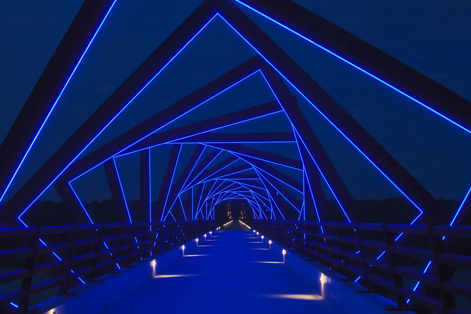
Colors, a silent form of communication that conveys much in a fraction of a second, can create different moods, express emotions, or even encourage people to act in certain ways. The use of colors that affect people’s emotional states in designs can create a certain emotional effect on users. At the same time, colors that align with the functional needs of a space can influence the perception of its size and overall usability.
Here are The Psychological Effects of Colors Used in Architectural Design:
Red

Red, one of the most powerful and striking primary colors in nature, is known as a warm and stimulating color. Triggering an instinctive response in human psychology, red is associated with passion and excitement. As a color that has effective subconscious qualities, red is popularly used in architecture.
Red, associated with energy, passion, and motivation, can create a dynamic atmosphere in spaces, making it ideal for environments that require energy, such as office buildings or gyms. In environments where the color red is used, people can feel more alert, energetic, and motivated. Additionally, because red is linked to intensity and love, it is often chosen for special event spaces to evoke feelings of elegance and attraction. The color red, which has an appetite-increasing effect on human psychology, is frequently preferred in kitchens and restaurants.
Red, which has an intense stimulus, can be used incorrectly in architecture, and a space can have more red than necessary, which can trigger emotions such as anger and fatigue in people. As a high-energy color, it’s more effective to use red to highlight specific objects rather than as a background or primary tone.
Red, which has a strong psychological effect on people, can be designed with a balanced use of the right tones, creating spaces with warmth, an inviting atmosphere, and visual appeal, while excessive use can lead to tension, stress, and discomfort in human psychology.
Blue
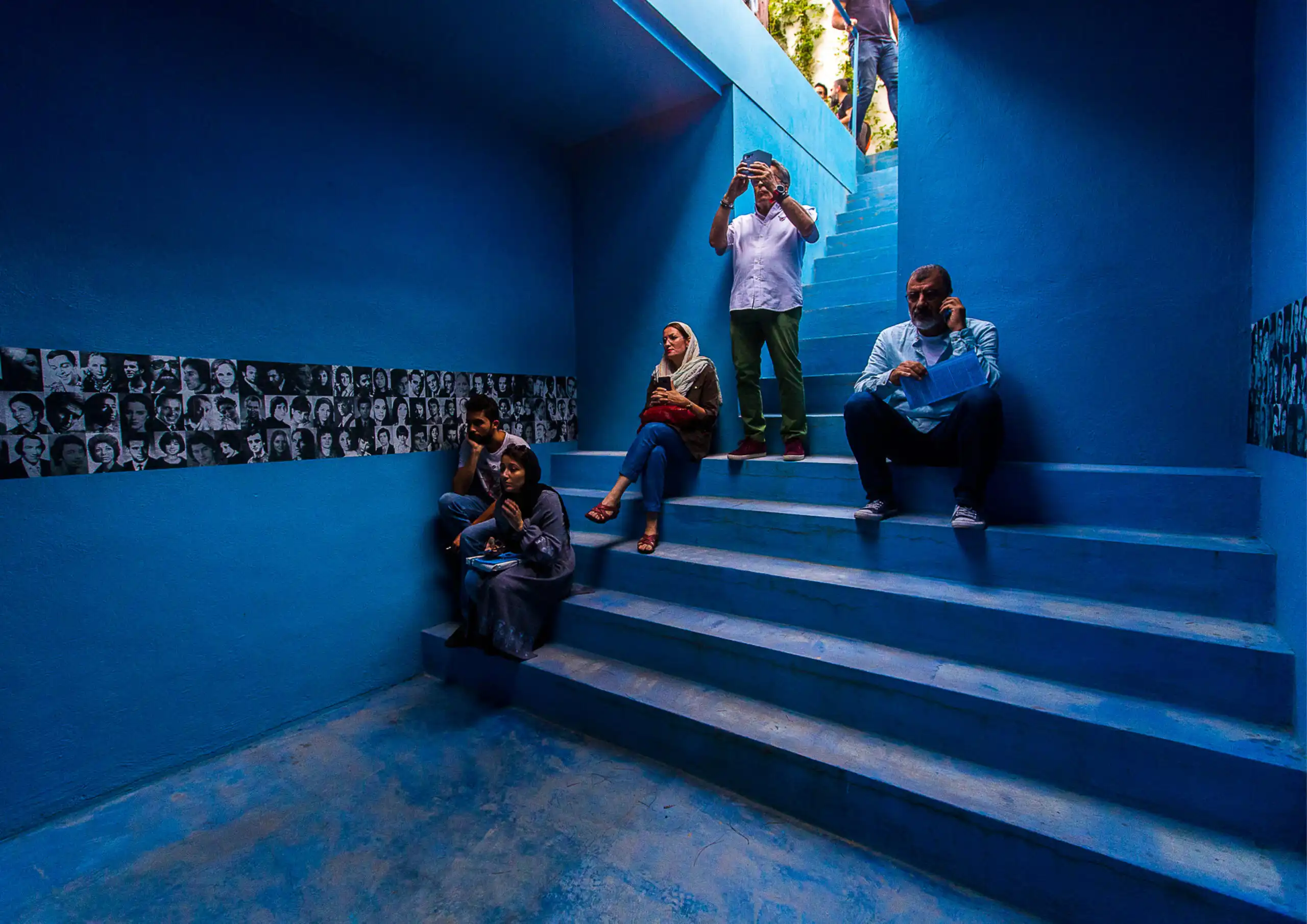
Blue, a psychologically powerful and versatile color, is a primary color frequently found in nature. Blue, which is associated with natural elements such as the sea and the ocean, has a calming, peaceful effect on human psychology. Promoting feelings of trust and tranquility, blue is often used in architecture to create serene and peaceful atmospheres. Its calming properties make it ideal for spaces such as meditation rooms, rehabilitation centers, and workspaces that require a sense of openness and spaciousness. Considering the physiological effects of blue tones, such as lowering blood pressure and reducing stress levels, it can be preferred for spaces such as health centers and hospital rooms.
Since blue is a color that absorbs light, its use in interior spaces should be carefully considered. Darker shades of blue, which reflect less light, can create a gloomy environment if natural light or interior lighting is insufficient. To counterbalance this, pairing blue with white can enhance its positive effects and reduce the likelihood of a somber atmosphere. At the same time, the combination of blue and gray provides a modern and sophisticated atmosphere; while the use of blue and yellow, which balance each other, together creates spaces with a lively and creative atmosphere.
Yellow
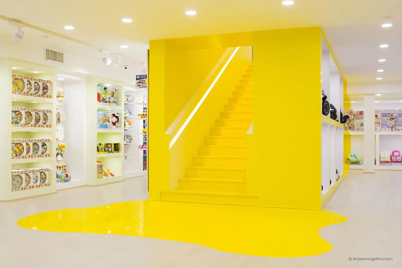
Yellow, perhaps the most intense color on the spectrum, is a warm and highly attention-grabbing color. A stimulating and energetic color, yellow has the power to improve people’s moods and increase energy because it resembles sunlight. Often chosen for children’s spaces like preschools due to its friendly and cheerful associations, yellow also promotes creativity and mental activity, making it a popular choice for creative workshops. Its energetic nature makes it ideal for creating a social and fun environment, and because it is an appetite-stimulating color, it is frequently used in kitchens and dining areas.
Although yellow represents hope and a positive mood, the intense use of wrong tones can be uncomfortable for the human eye. While very vivid and bright yellow tones cause stress and anxiety in human psychology, the intense use of dark tones can evoke autumn and sadness. In Eastern cultures, yellow symbolizes wisdom, but when used incorrectly, it can create a confusing effect on the mind, making it unsuitable for workspaces. When used carefully and in moderation, yellow can add richness and balance to designs when combined with colors like white, blue, gray, green, and purple.
Orange
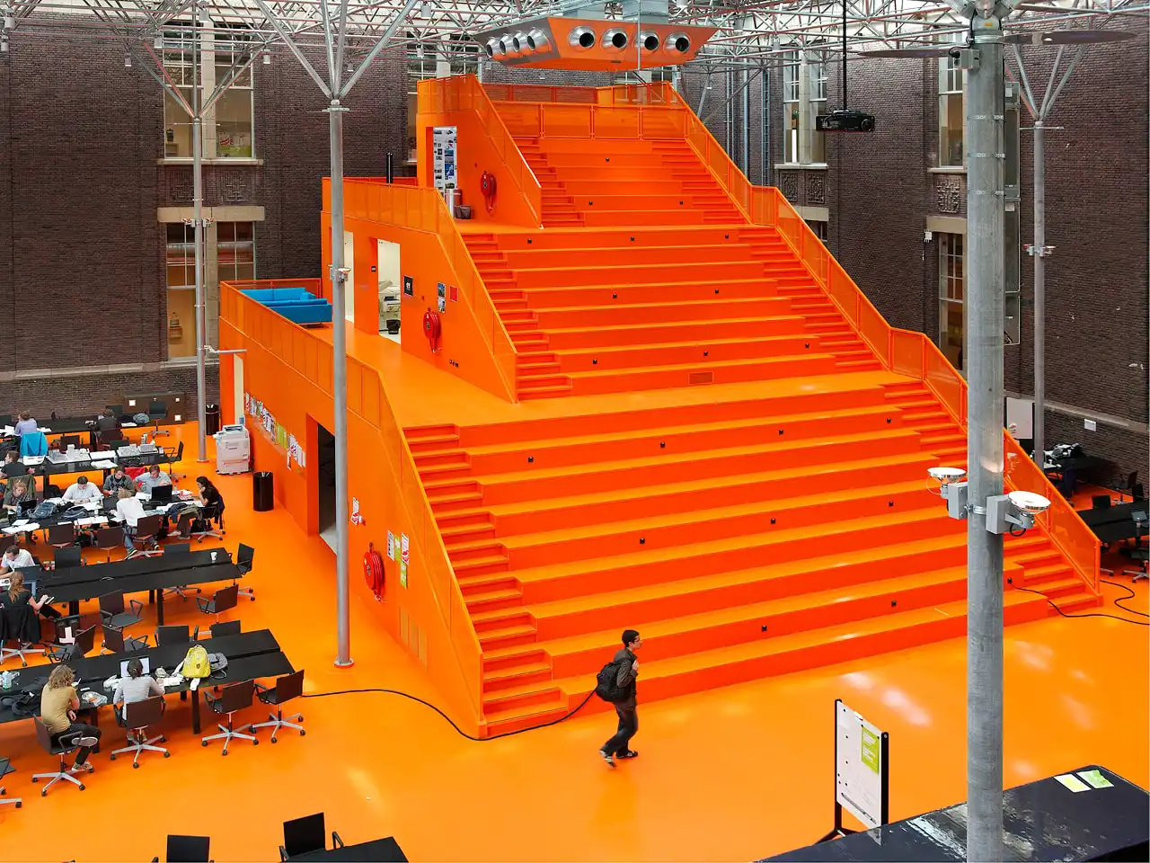
Orange, a vibrant combination of red and yellow, is a warm and energetic color that has a powerful impact on human psychology. Associated with energy, excitement, and joy, orange is a strong tool for architects, helping them design spaces that empower and encourage users. Orange, which is an extrovert color, is preferred in spaces where a sense of joy and happiness is desired, such as children’s rooms. It is also used in restaurants due to its appetite-stimulating effect.
Orange is a stimulating color, but compared to red, it is a less intense and calmer option. Additionally, it is less aggressive, making it suitable for use in larger quantities without being overwhelming. However, the vibrant tones of orange, which is a high-energy color, can be very stimulating and long-term exposure to it can cause focus problems for users. Therefore, it should be used in a limited and balanced manner in work environments that require concentration. While orange has positive effects, overly bright tones used in large quantities can lead to overstimulation and irritability in people.
The balanced use of orange creates a lively, energetic and positive effect in architecture. Since its use on exterior facades creates a striking and inviting effect, it is used especially in commercial buildings, stores and restaurants, inviting customers inside. Orange, which is also preferred in the design of parks and squares, is a color that reflects the liveliness of cities.
Green

Green, a combination of yellow and blue, is the color of harmony, generosity, and sharing. Green, which can be defined as the color of nature, instills a sense of trust, soothes and provides peace. Green has a relaxing and calming effect, therefore spaces where green is used create an atmosphere that provides calm and peace. Associated with balance and harmony, green is linked to healing, rebirth and health, therefore it is frequently preferred in hospitals and health centers and creates a calming effect.
Green has a positive impact on creative thinking, and its use in workspaces, offices, and schools can provide mental relaxation for users. Lighter shades of green are often preferred in kitchens, while darker tones are suitable for flooring and tiles.
Purple
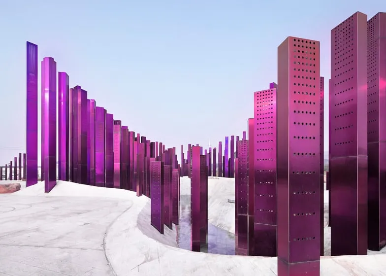
Purple is a powerful color obtained by mixing yellow and red, which are generally associated with nobility, and can leave a lasting impression with its striking feature. With both calming and stimulating properties, purple is a rich color associated with elegance and luxury. Historically associated with royalty and thus evoking feelings of wealth and mystery, purple is a preferred color for high-end spaces such as luxury hotels, restaurants, and spas. Lighter, pastel shades of purple, symbolizing peace and inner balance, are ideal for therapy and meditation rooms.
When used correctly, purple adds sophistication to both interior and exterior spaces, creating a strong emotional impact in design. However, excessive use of darker shades of purple can create a cold and gloomy atmosphere. Spaces designed with excessive use of purple can create negative emotions such as boredom and depression in people.
White

White, a color with significant importance in architecture and a broad psychological impact, is associated with purity, clarity, cleanliness, and simplicity. White, which is effective in spaciousness, openness and minimalism, is often preferred in the health sector, hospitals and clinics because it symbolizes cleanliness. As a calming color, white creates a peaceful effect in interior spaces, while its neutral impact fosters environments conducive to rest and relaxation. Thus, it is preferred in spaces such as spa areas and meditation rooms.
A color frequently used in modern architecture, white has the ability to create a sense of order and is popular in contemporary homes and art galleries. White can hide a variety of formal gestures and, when used as a background color, can be both beautiful and almost invisible. Its versatility allows it to harmonize with many other colors, making it a preferred choice for many designers.
However, spaces designed with intense white without support from other colors can become lifeless environments that evoke a sense of emptiness. Since excessive use of white can make spaces feel cold and sterile, the correct use of white is very important for design.
Black
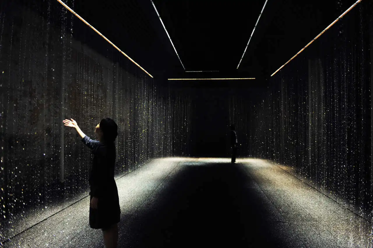
Black, which has a very strong effect in architecture, is generally used in spaces to add elegance and depth. Used relatively rarely in large spaces, black is associated with power, prestige and authority. Black, which evokes power and authority, is a frequently preferred color for the design of spaces such as government buildings and law offices. Associated with elegance and luxury, black can be used in spaces such as high-class hotels, restaurants, and luxury stores.
Black, which can be functional and convenient for some spaces with its sense of seriousness and severity, can, on the other hand, evoke negative and depressive feelings in people if used excessively. Especially in small spaces, the intense use of black can narrow the space and cause a suffocating feeling.
Density of Colors
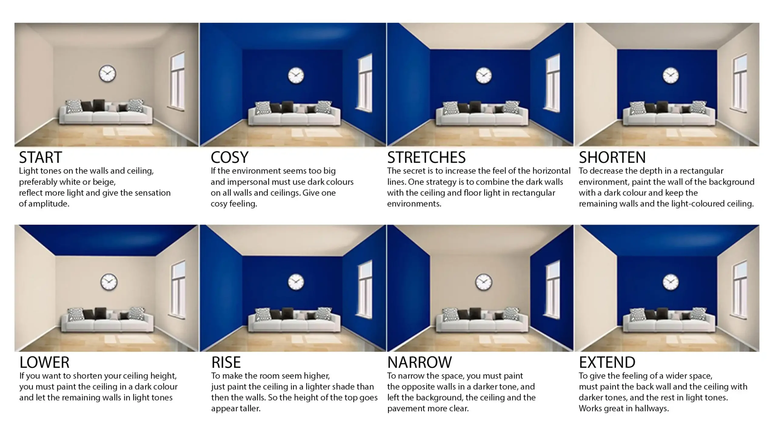
Spaces give different effects according to the selected color. Color selection should be selected correctly considering the function of the designed space. However, the intensity of the application of the selected color in a space changes its effect on the space. For example, if only the side walls of a space are painted the chosen color, it creates a feeling of a narrower space. But if the color is applied to all the walls, the space appears deeper than it actually is.
If the ceiling is painted a darker color than the walls, it creates a sense of a lower area. On the other hand, if color is applied to the middle wall, it visually gives the impression of a spatial shortening. When all the surfaces of a space are painted to half height, and darker tones are applied to the upper surfaces, the room’s height is reduced, and the focal point is placed at eye level. If a wider room feeling is desired, the middle wall and ceiling should be painted in the same tone.
Learn with PAACADEMY: Attend workshops at PAACADEMY to learn from the industry’s best experts how to use advanced parametric design tools, AI in design workflows, and computational design in architecture!
